Your comment reads like a poem! Thank you, Kim. I was on the fence about posting this one. For starters, it was done on rough watercolor paper (I prefer cold-pressed paper), and the rough texture dulled the colors, in my opinion. Secondly, the overall painting feels a little tight. It’s actually a mini painting that looks better in its original size. But this theme I am using blows up the featured images like crazy (does that bother you, I’d appreciate your opinion). Like you, I might also have to revamp my website at some point.
You’re very welcome 🙂 I think this looks great, and that’s why It’s so nice when people post what they are unsure about. Sometimes it almost hurts posting a painting that I’m very unpleased with, but then suddenly someone makes me see it in a totally different way 🙂 I think the colours really says spring time, and I really like the depth, which draws me into the painting through the road and makes me wonder what lies ahead 🙂 I can imagine the colours being even more radiant on the palette, but I didn’t think of it as faded on the paper.
I open the picture in a new tab on my browser, so I can see the whole thing at the same time. I can’t do that on the post without zooming out my screen, but it doesn’t bother me, no. But I guess it might be more difficult if someone don’t know about that option. Your site looks very good, though. So I wouldn’t worry too much about it 🙂
Thank you so much for taking the time to reply. I am figuring out where to go with this blog, especially in terms of showing only “perfect” paintings… or if I should be writing more blog posts. I’m glad you saw depth in the painting because that’s something I have been practicing. I think once I go out and sketch more, the art might improve. Cheers, Laureen
I really like the blues running through the painting. They help bring out the yellows. Also the diagonal dark green branch in the upper section helps to unify the composition. Very vibrant color.
Thank you Jeff. I am practicing my greens. It helps to work with transparent colors. Happy to read that you think the colors are vibrant. I wasn’t sure anymore.
I love how lush it looks. You actually want to be there and walk though it. Looking at the rest of your gallery I like the forest paintings the most! 🙂
Thank you so much! It is, indeed, a beautiful path, and I’m glad I get to walk it quite often. I really appreciate you stopping by. Will have another peek at your work. Best, Laureen
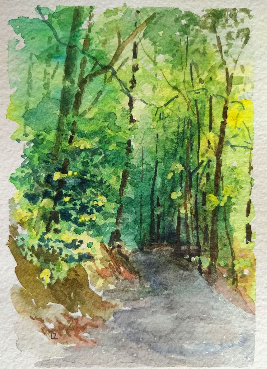

Really nice! Spring is my favourite time of the year. Nature is waking up again, and summer is near ☺
LikeLiked by 1 person
Your comment reads like a poem! Thank you, Kim. I was on the fence about posting this one. For starters, it was done on rough watercolor paper (I prefer cold-pressed paper), and the rough texture dulled the colors, in my opinion. Secondly, the overall painting feels a little tight. It’s actually a mini painting that looks better in its original size. But this theme I am using blows up the featured images like crazy (does that bother you, I’d appreciate your opinion). Like you, I might also have to revamp my website at some point.
LikeLiked by 1 person
You’re very welcome 🙂 I think this looks great, and that’s why It’s so nice when people post what they are unsure about. Sometimes it almost hurts posting a painting that I’m very unpleased with, but then suddenly someone makes me see it in a totally different way 🙂 I think the colours really says spring time, and I really like the depth, which draws me into the painting through the road and makes me wonder what lies ahead 🙂 I can imagine the colours being even more radiant on the palette, but I didn’t think of it as faded on the paper.
I open the picture in a new tab on my browser, so I can see the whole thing at the same time. I can’t do that on the post without zooming out my screen, but it doesn’t bother me, no. But I guess it might be more difficult if someone don’t know about that option. Your site looks very good, though. So I wouldn’t worry too much about it 🙂
LikeLiked by 1 person
Thank you so much for taking the time to reply. I am figuring out where to go with this blog, especially in terms of showing only “perfect” paintings… or if I should be writing more blog posts. I’m glad you saw depth in the painting because that’s something I have been practicing. I think once I go out and sketch more, the art might improve. Cheers, Laureen
LikeLiked by 1 person
I’ll be following along whichever way you choose to go with the blog 🙂
LikeLike
Thank you so much and have fun with your next painting!
LikeLiked by 1 person
I really like the blues running through the painting. They help bring out the yellows. Also the diagonal dark green branch in the upper section helps to unify the composition. Very vibrant color.
LikeLike
Thank you Jeff. I am practicing my greens. It helps to work with transparent colors. Happy to read that you think the colors are vibrant. I wasn’t sure anymore.
LikeLike
I love how lush it looks. You actually want to be there and walk though it. Looking at the rest of your gallery I like the forest paintings the most! 🙂
LikeLike
Thank you so much! It is, indeed, a beautiful path, and I’m glad I get to walk it quite often. I really appreciate you stopping by. Will have another peek at your work. Best, Laureen
LikeLiked by 1 person
I can see your love for the place in the piece! Well done!
Thank you!
LikeLiked by 1 person